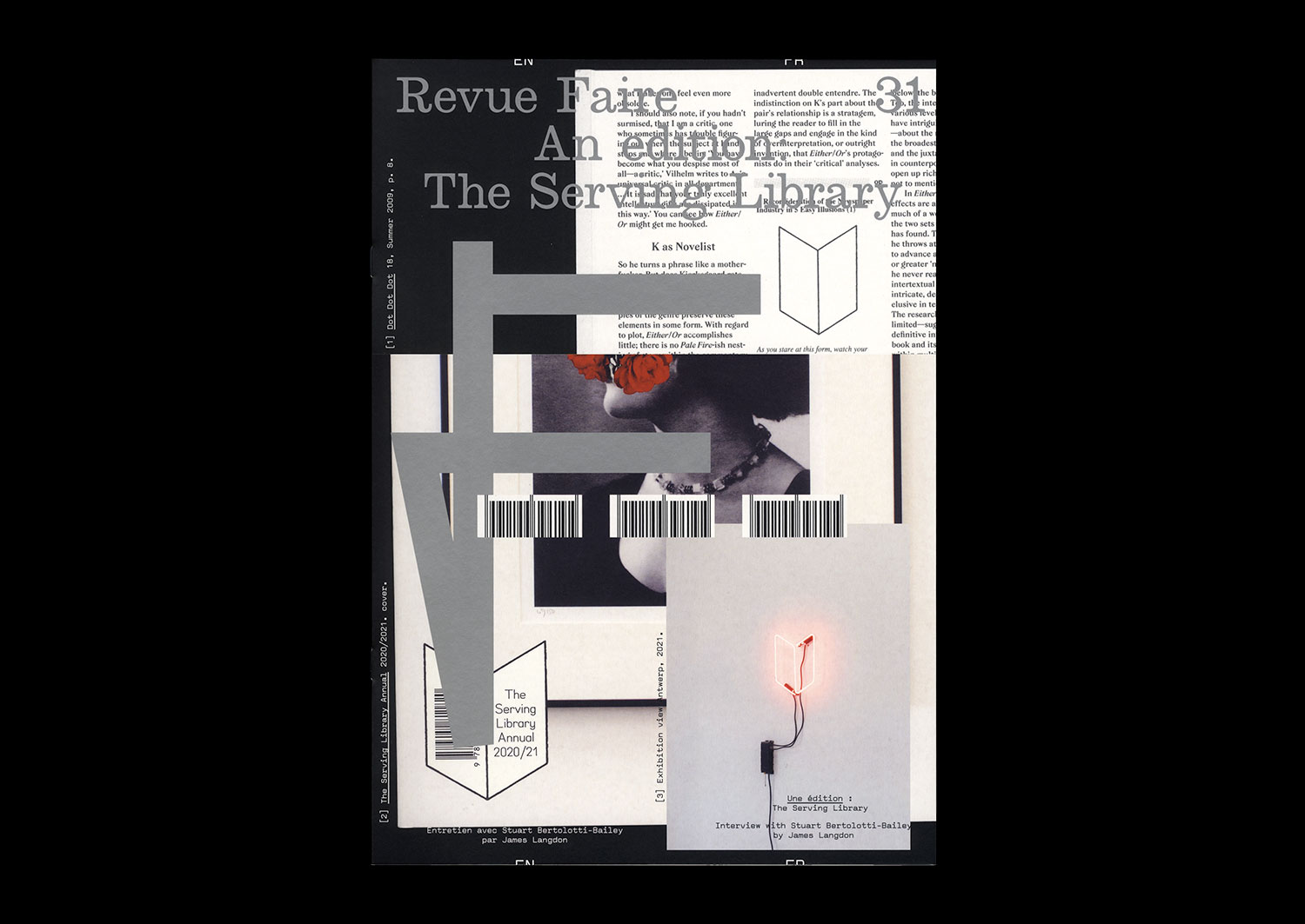
n°31 — An Edition: The Serving Library. Interview with Stuart Bertolotti-Bailey by James Langdon
Out of print, available only with the season 3 subscription
Interview with Stuart Bertolotti-Bailey by James Langdon
20 pages, 21 × 29,7 cm, CMYK + 1 PMS on cover
27th October 2021
isbn 979-10-95991-19-9
issn 2558-2062
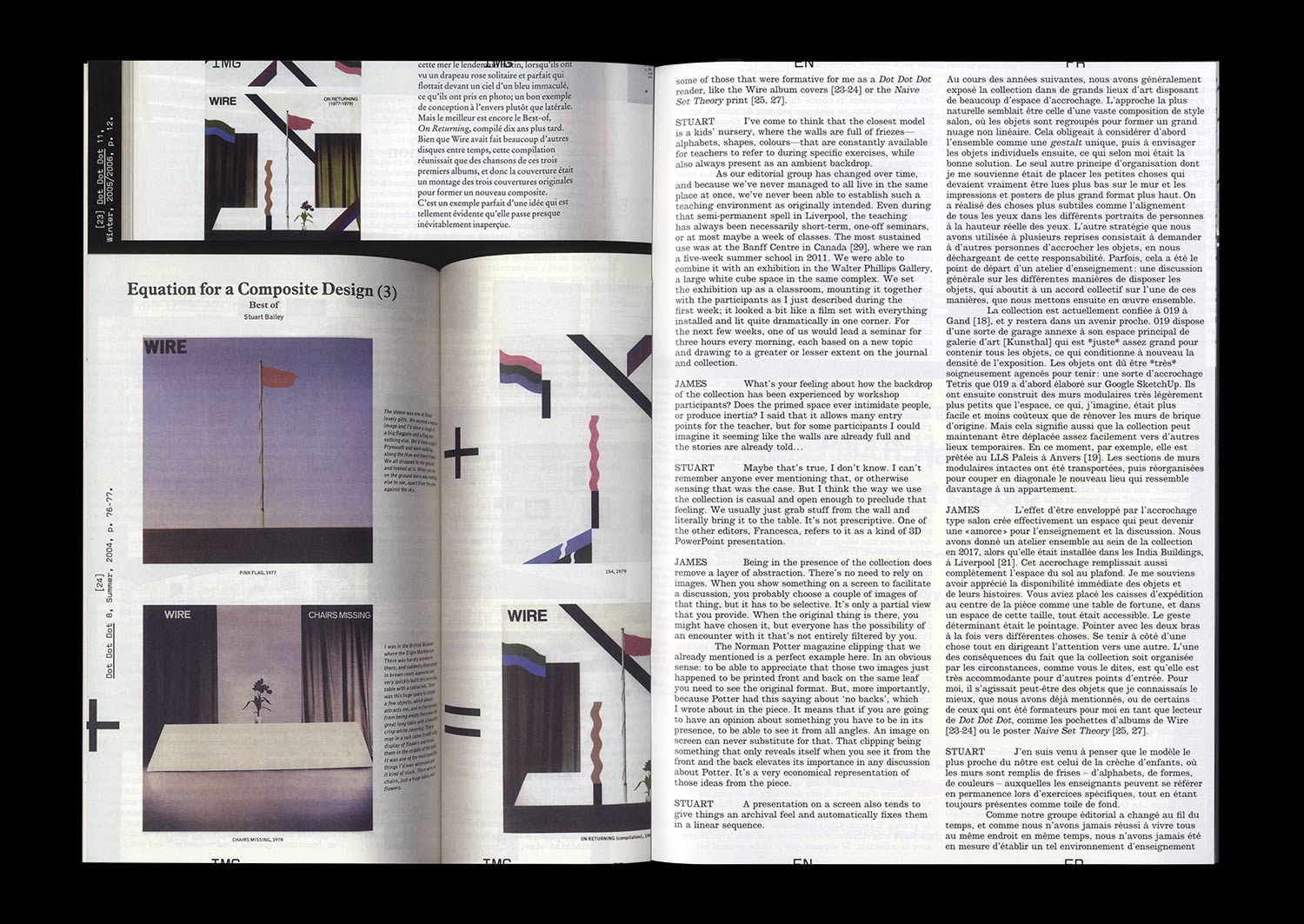
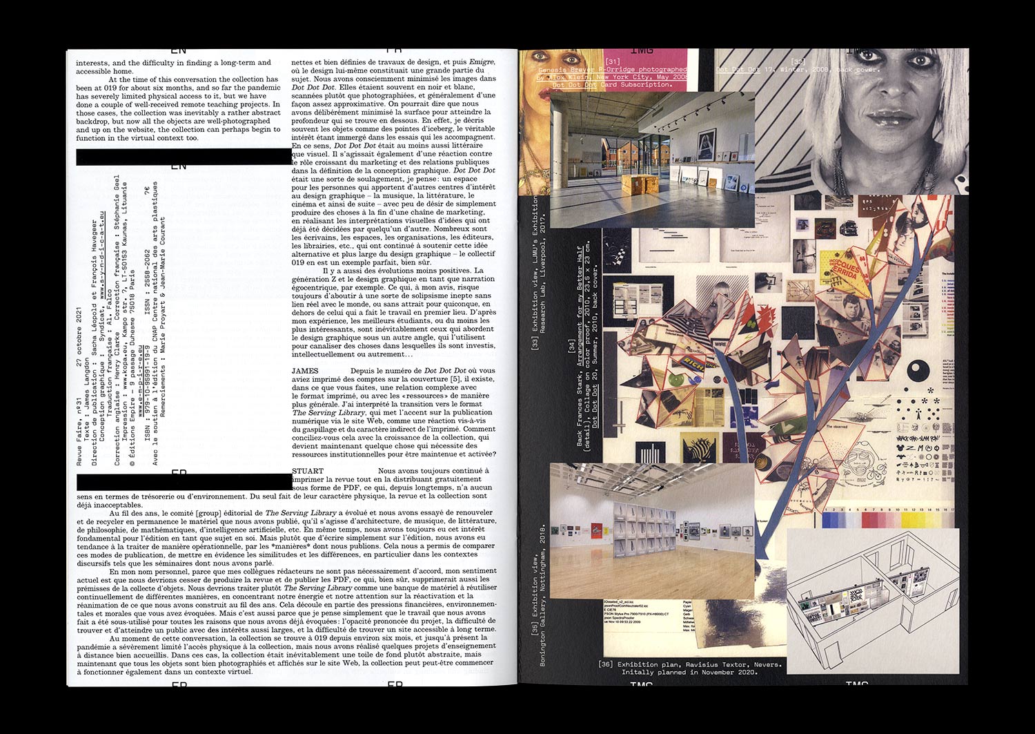
Dot Dot Dot magazine has always antagonised factions of the graphic design community. While it was definitely just a magazine about graphic design, Dot Dot Dot admitted that graphic design was itself *about* — or at least inseparable from — whatever content it might be used to express. With that innocent assertion, it became, without necessarily trying, a magazine about the potential subject matters of graphic design. A magazine about anything and everything, then! The final Dot Dot Dot was published in 2010. Its successor publication, Bulletins of The Serving Library, has continued its expanded editorial purview.
In the course of these 20 years of publishing, its editors have amassed a significant collection of almost 100 objects that have appeared in the magazines. The collection’s contents are by nature various, in format and intent: from images produced to commission for articles, to artworks representing particular histories, positions, and significant practitioners. In autumn of 2020 this collection relocated to an annex of the artist-run space 019 in Ghent, with the prospect of a long-term home there as a teaching space rich with connective threads leading in and out of the recent history and practice of graphic design.
You may also like…
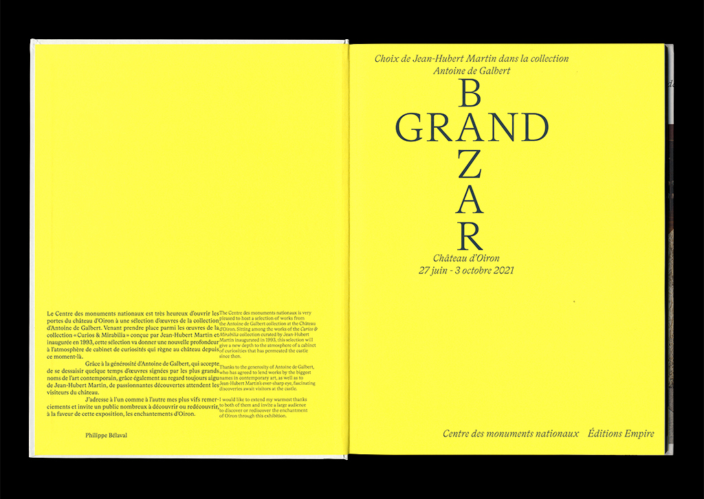
Grand Bazar, choix de Jean-Hubert Martin dans la collection Antoine de Galbert
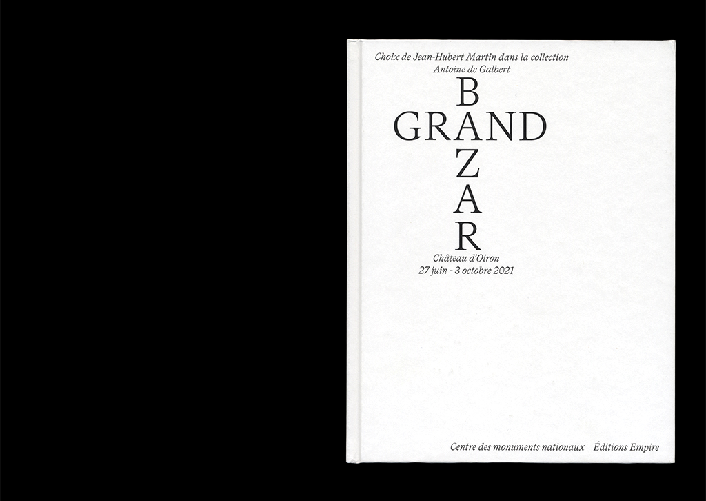
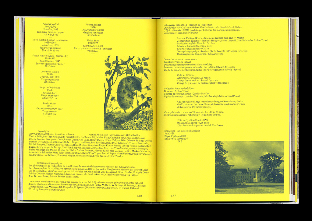

Empire books & Chateau d’Oiron, Centre des Monuments Nationaux
isbn 979-10-95991-26-7
French / English
160 pages
CMYK + 2 Pantone ©
215 × 27,5 mm
Hard cover
Design: Syndicat
Photos: Julia Andréone
24 €
2021
Empire books & Chateau d’Oiron, Centre des Monuments Nationaux
isbn 979-10-95991-26-7
French / English
160 pages
CMYK + 2 Pantone ©
215 × 27,5 mm
Hard cover
Design: Syndicat
Photos: Julia Andréone
24 €
2021
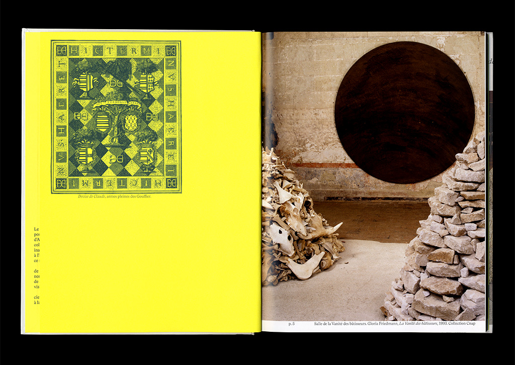
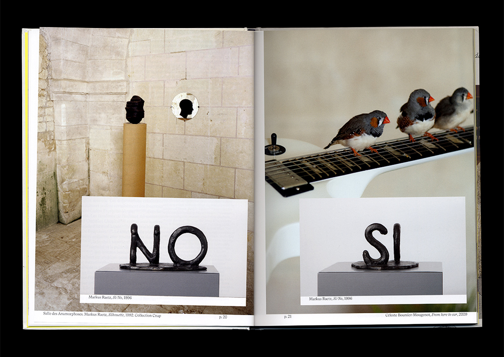
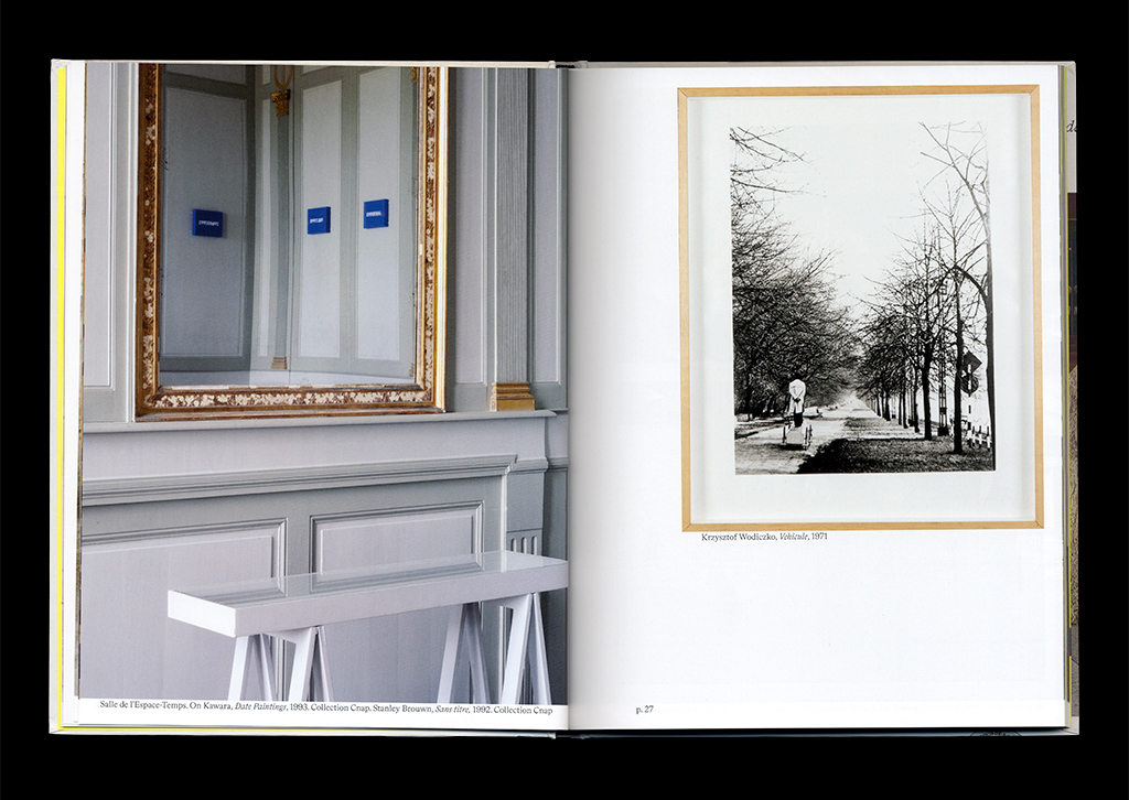
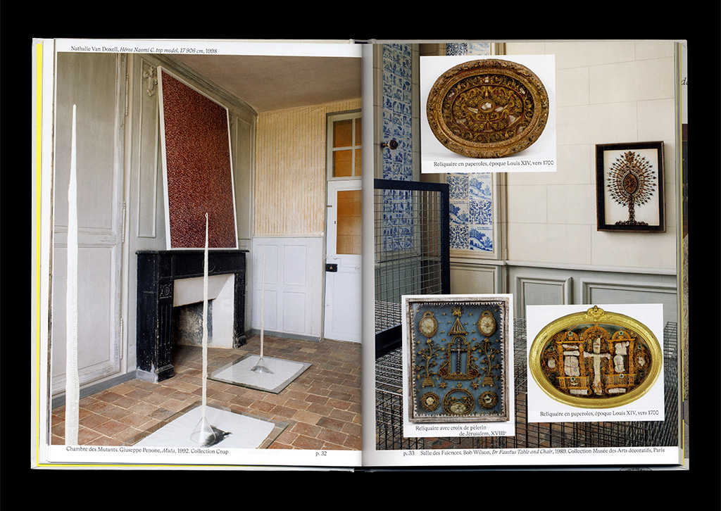
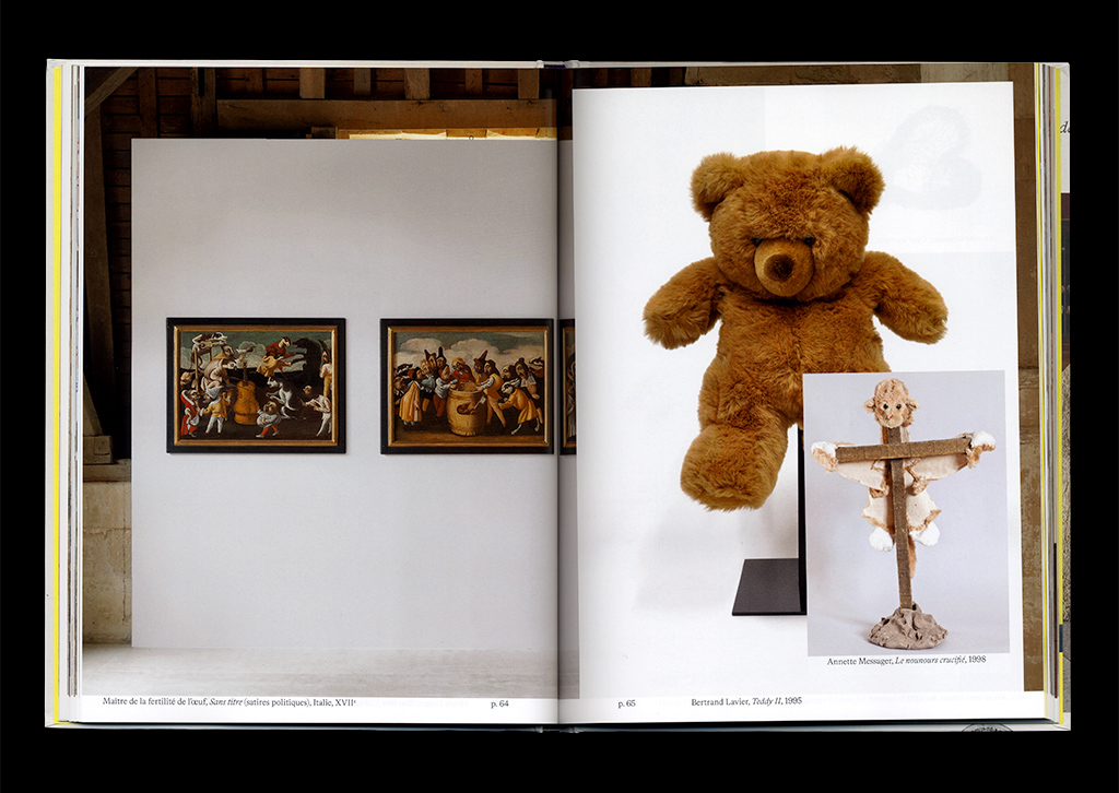
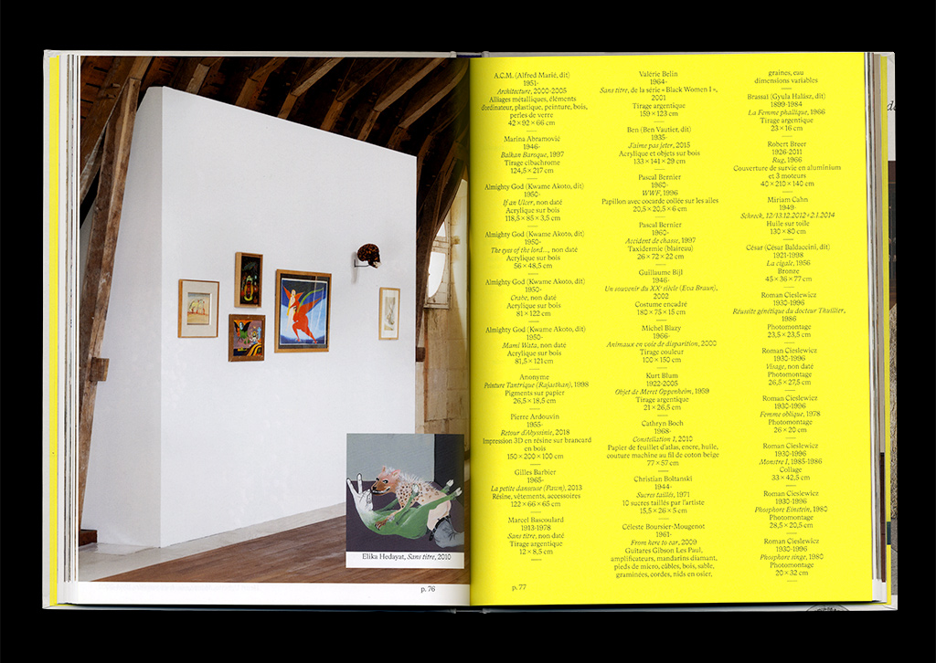
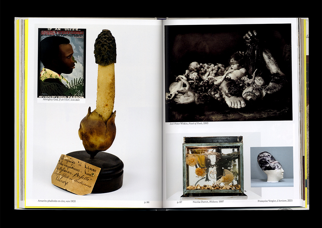
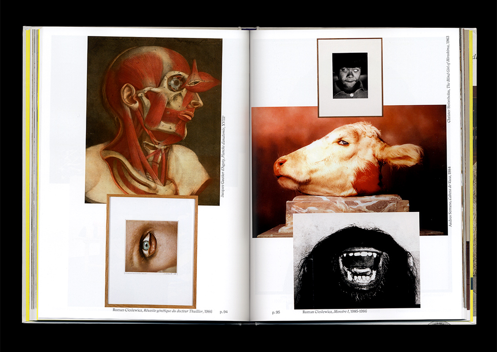
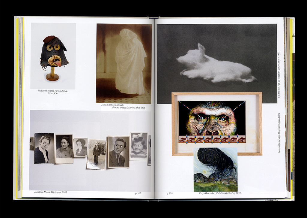
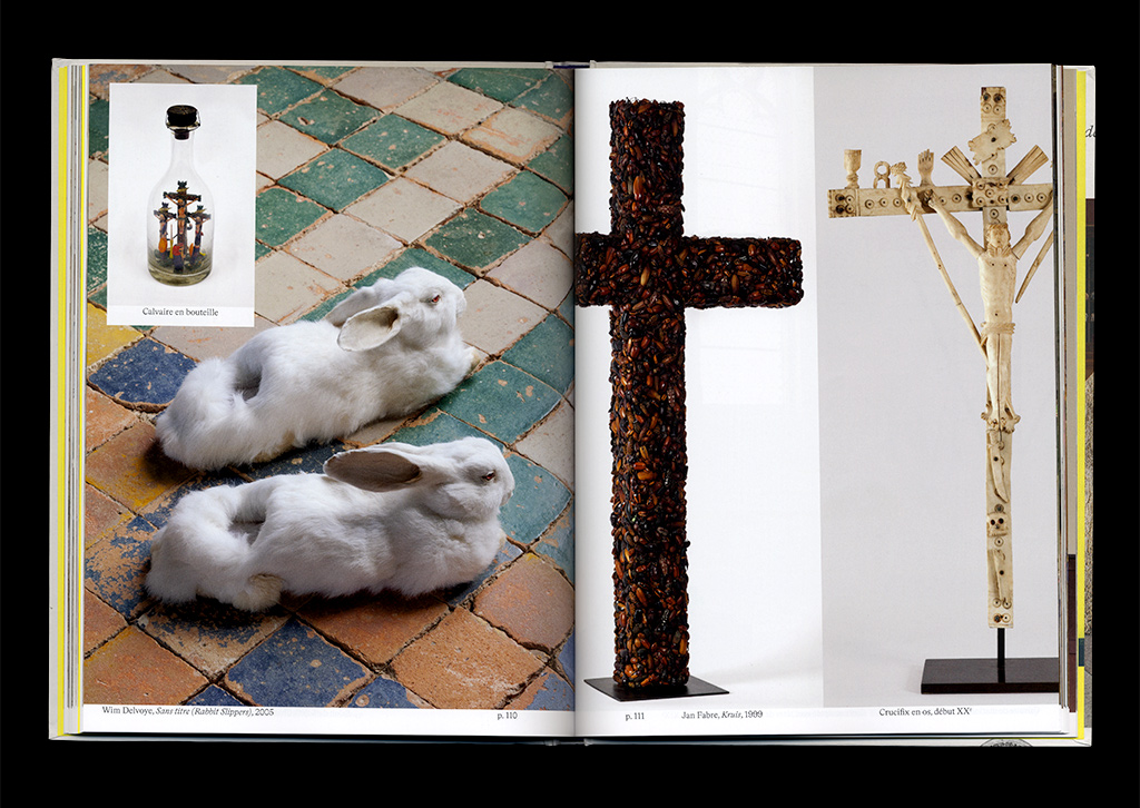
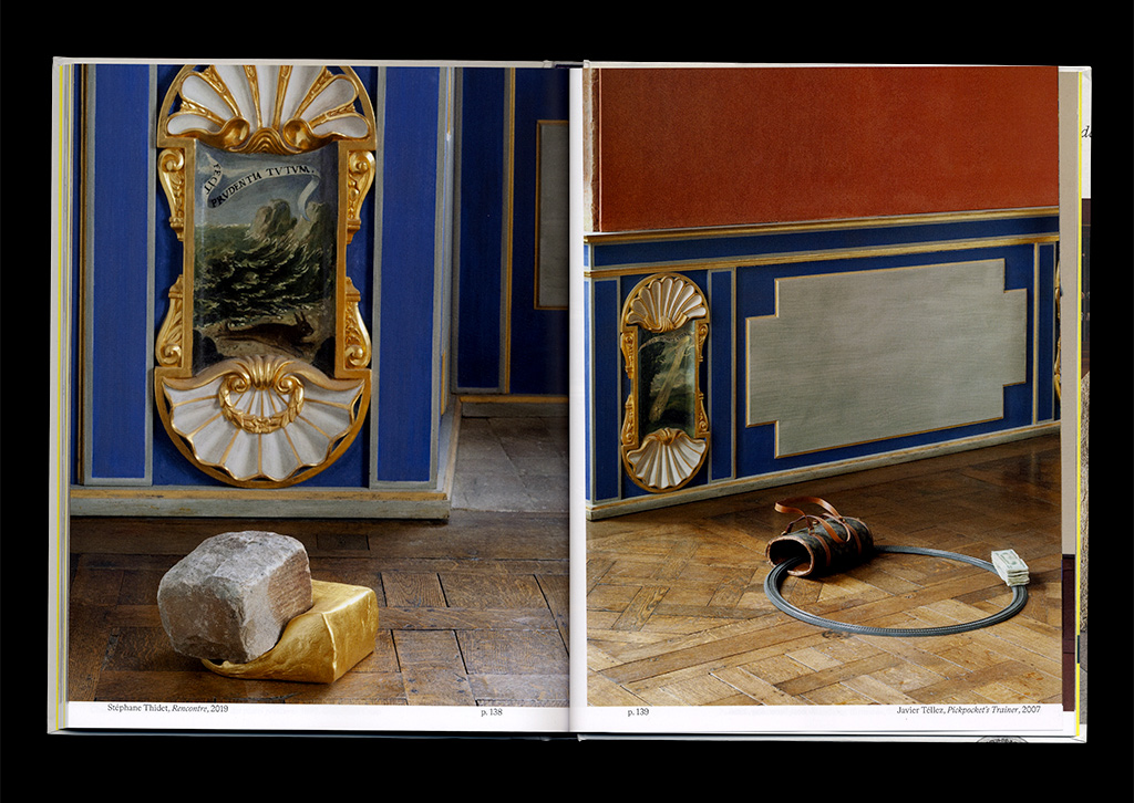
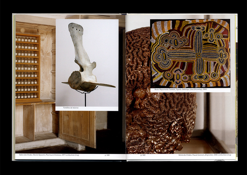
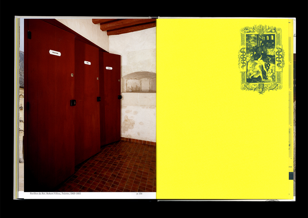
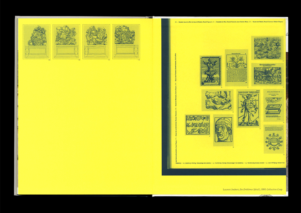
The exhibition catalogue for the Château d’Oiron presents more than 170 artworks from the collection of Antoine de Galbert, placed in such a way as to dialogue with the permanent collection of contemporary art Curios & Mirabilia, assembled by the same Jean-Hubert Martin in 1993. The collection of Antoine de Galbert is deployed in exhibition galleries according to themes inherent to it, with great importance being attached to the eye, the face and its expressions, and to injuries. The confrontation of these two collections and the dialogue established between the two men give rise to new effects of surprise in the catalogue thanks to collages that are as frontal as they are playful. The catalogue displays all of the artworks presented in the space, including From here to ear by Céleste Boursier-Mougenot whose music can be heard within these 16th century walls. A number of artists are featured in both collections: Hubert Duprat, Markus Raetz, Wim Delvoye, Annette Messager, Christian Boltanski, Marina Abramovic, Bertrand Lavier, Nicolas Darrot… Others have onlyrecently entered Oiron: Théo Mercier, Gilles Barbier, Stéphane Thidet, Barthélémy Toguo, Jackie Kayser, Steven Cohen
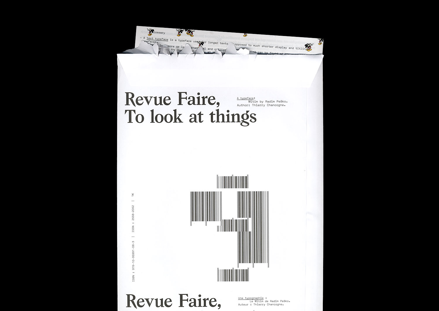
n°09 — A typeface: Mitim by Radim Pesko. Author: Thierry Chancogne
Sold out
Author: Thierry Chancogne
16 pages, 21 × 29,7 cm, CMYK + 4 cards in an envelope
28 February 2018
isbn 979-10-95991-08-3
issn 2558-2062
Sold out
Author: Thierry Chancogne
16 pages, 21 × 29,7 cm, CMYK + 4 cards in an envelope
28 February 2018
isbn 979-10-95991-08-3
issn 2558-2062
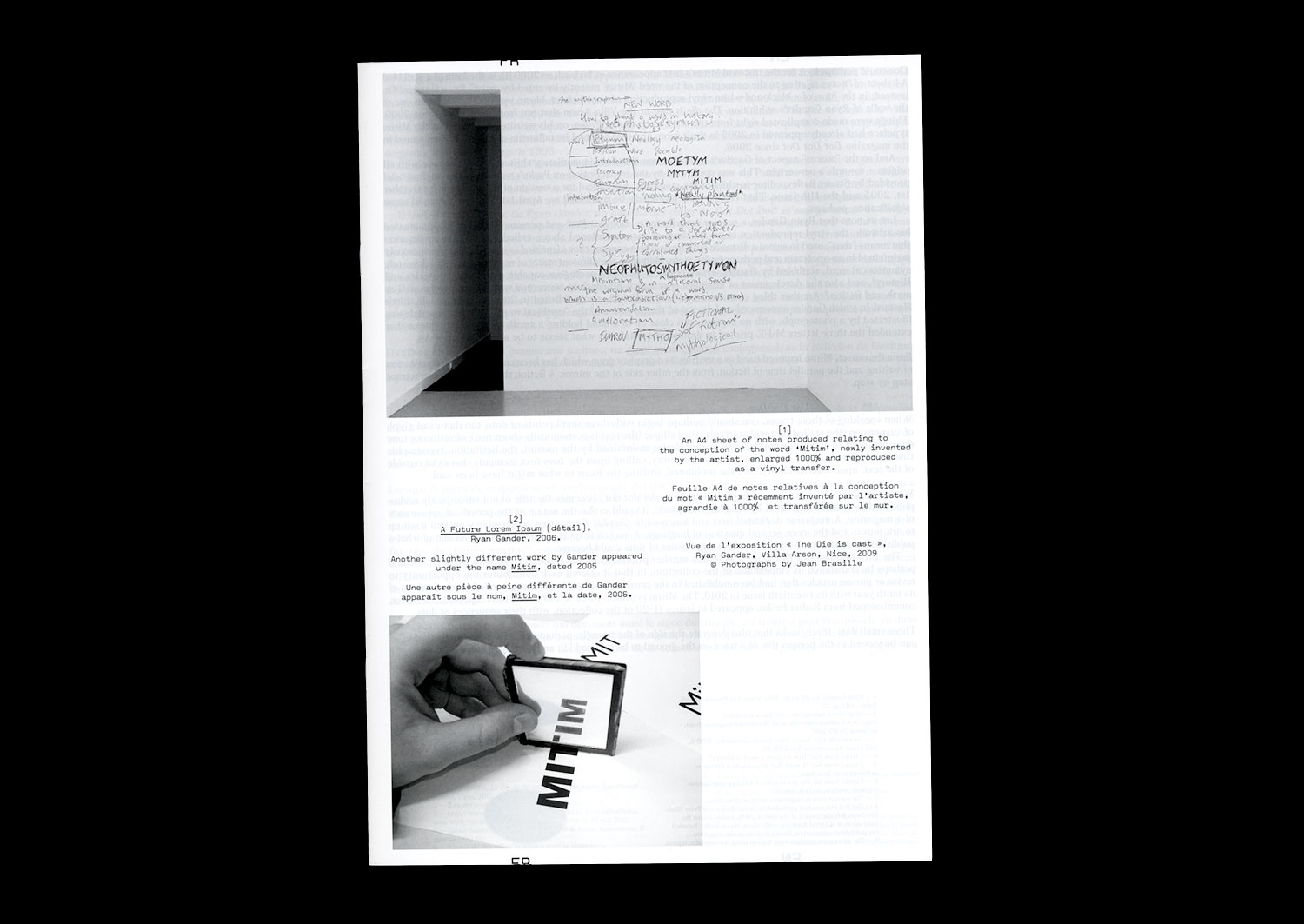
Mitim. Three letters interpolated into a palindrome and an ambigram, /Mit/ in Dutch, as in German, means “with.” Three peaks, an effect of symmetry and circulation. The triadic structure of the sign. Of what takes place. Of what binds. Signifier, Signified, Reference.
Mitim. A typeface designed by Radim Pesko for Dot Dot Dot. Again, three characters and a distribution. Three points that follow and invite pursuit, even if the period of this essential review ceased, ten years and twenty issues later.
Mitim. A spun figure of a triangle that calls on asterism, a constellation of stars that is the figure of the constitution of meaning, at the same time being the typographical sign of changing paragraphs, or tailpiece. A prolific sign of rupture and continuation that marks the condition of every text and any periodical publication. A sign that proposes, in its form of a horizontal line of stars, an equivalent of the ellipsis, or “dot dot dot” as it is more commonly known.
Mitim. A triangular figure that refers to typographic signs of logic and mathematical relationships: consequence ·˙·, cause ˙·˙. In certain Masonic expressions, a figure that is one of abbreviation, of predictability, and of redundancy like that which is hidden in the sign: the sign of the secret to be deployed, the secret to be pursued.
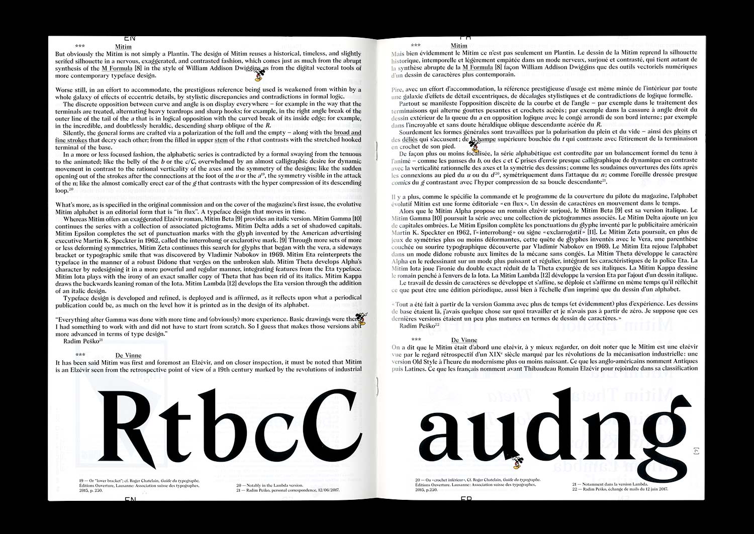
Mitim. A typeface design that extends to become a self-reflexive artistic and typographic project. An alphabet that evolves and adapts to the cycle of appearances of a publication in the form of a suite.