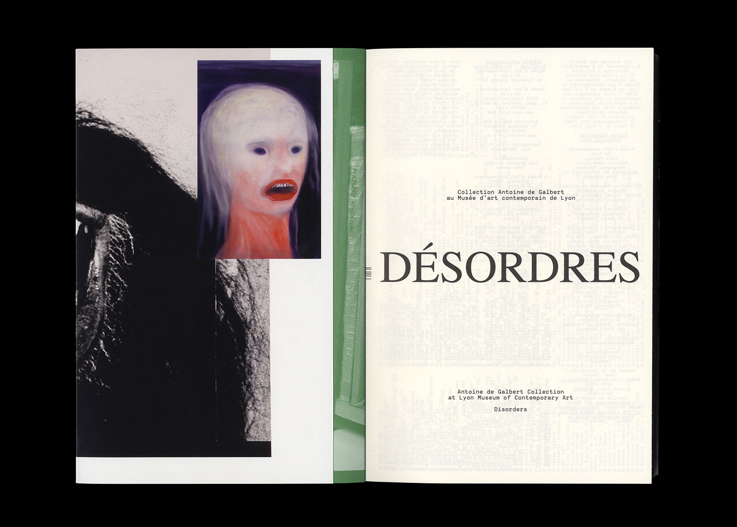
Disorders — Antoine de Galbert Collection at Lyon Museum of Contemporary Art


Texts by Sophie Delpeux, Bérangère Amblard, Lola Carrel
isbn 979-10-95991-35-9
isbn 979-10-95991-35-9
French/English
17,2 x 25 cm (softcover)
240 + 28 pages
Design: Syndicat
2024
Design: Syndicat
2024
25 €
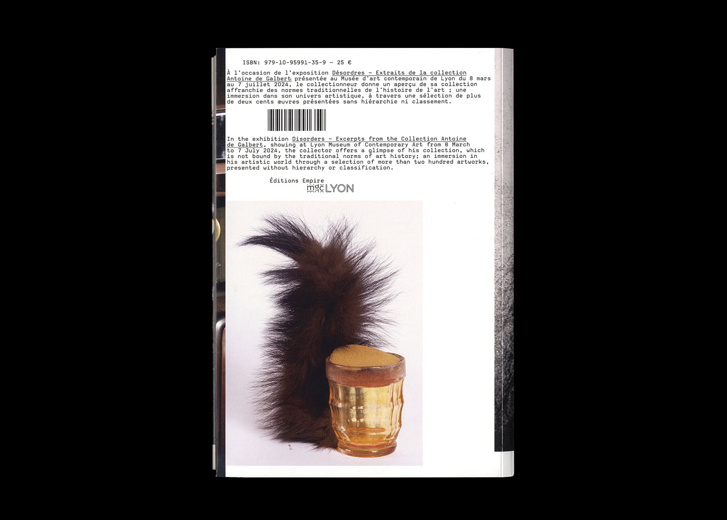
Antoine de Galbert offers a glimpse into his collection, freed from the traditional norms of art history: an immersion into his artistic universe, through a selection of over two hundred works presented without hierarchy or classification.
Antoine de Galbert has been working for numerous years to promote and support contemporary art, mainly through the foundation he established in 2003. He was also the founder and president of La Maison rouge, an exhibition space whose artistic programme marked the Parisian arts scene between 2004 and 2018. For over thirty years, Antoine de Galbert has been collecting contemporary art with a strong focus on Art Brut, as well as other forms of ethnological and/or folk art. His eclectic collection bears witness to his insatiable curiosity and the interest he has taken in both internationally recognized artists and young artists whose works are still little known. His self-taught yet confident sensibility has afforded him free rein in the selection of pieces, allowing him to bring together an independent collection freed from the traditional norms of art history. His commitment to the art world and the relationship he maintains with the artists in his collection make him a passionate and exciting collector.
The artworks in Antoine de Galbert’s collection are regularly presented in exhibitions in France and overseas alike. He has also made several significant donations to a number of prestigious collections including those of the Musée des Confluences in Lyon in 2017 (the donation of 530 headpieces), the Musée de Grenoble in 2023, as well as the Centre Pompidou, Château d’Oiron, and Musée des Beaux-Arts de Lyon.
Designed in close collaboration with Antoine de Galbert, the exhibition Disorders – Excerpts from the collection Antoine de Galbert at the macLYON features over 250 works, showcasing the wealth and singularity of his collection.
Published on the occasion of the eponymous exhibition at Lyon Museum of Contemporary Art from March to July 2024.
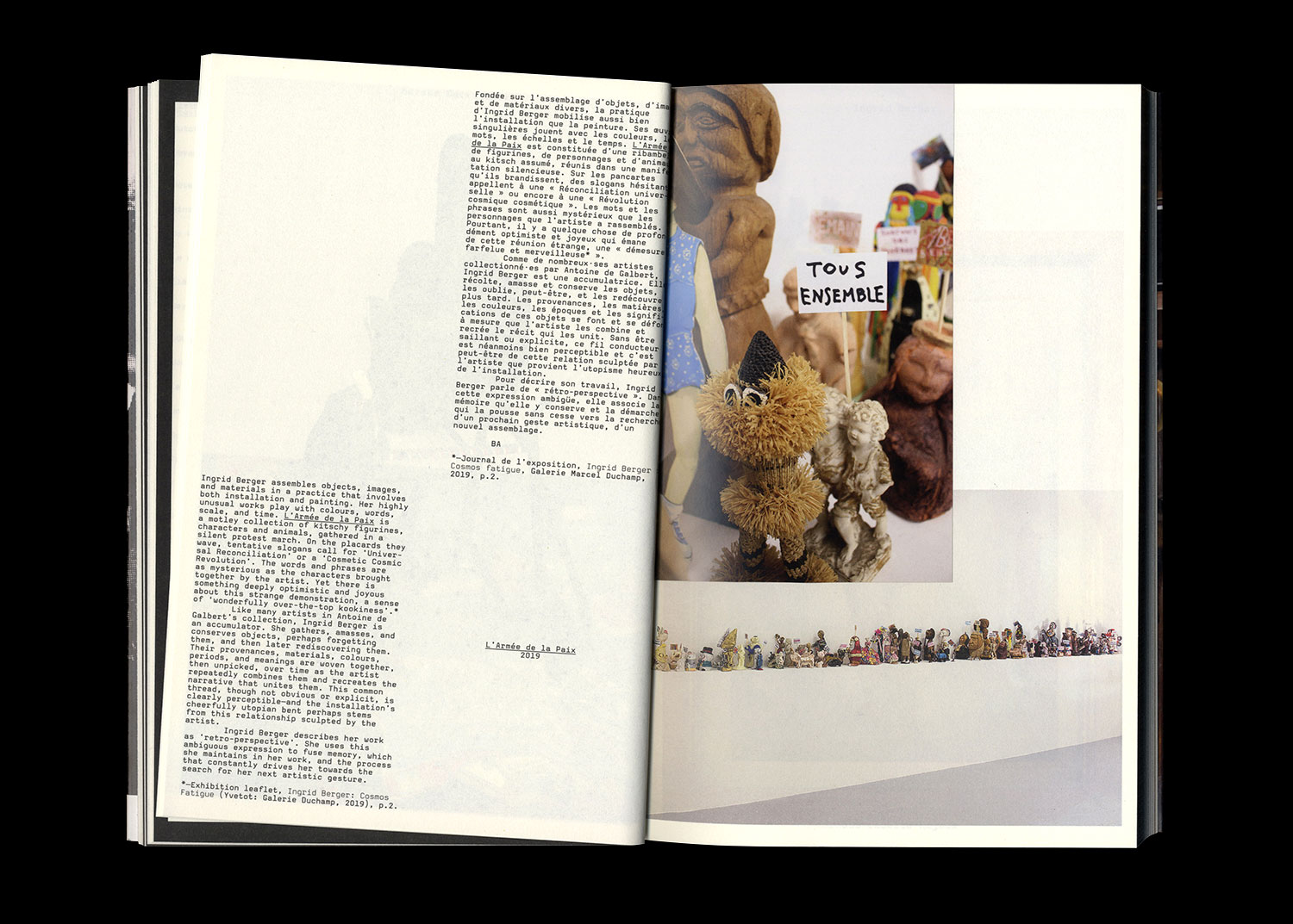
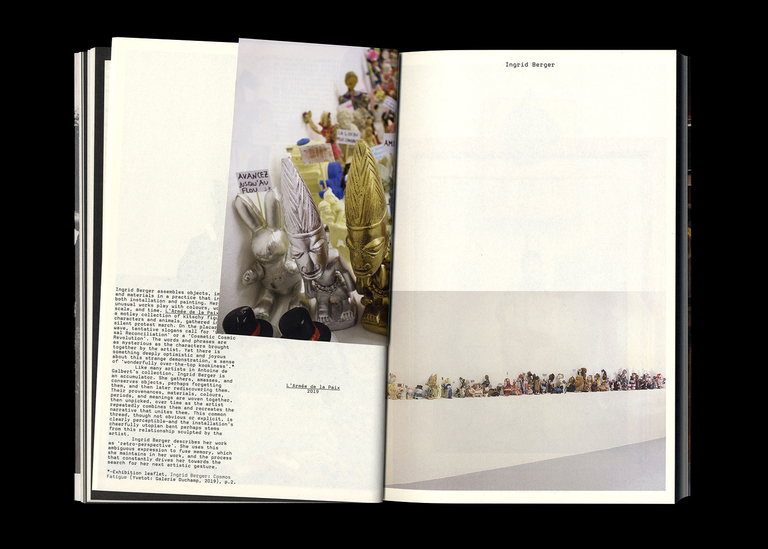
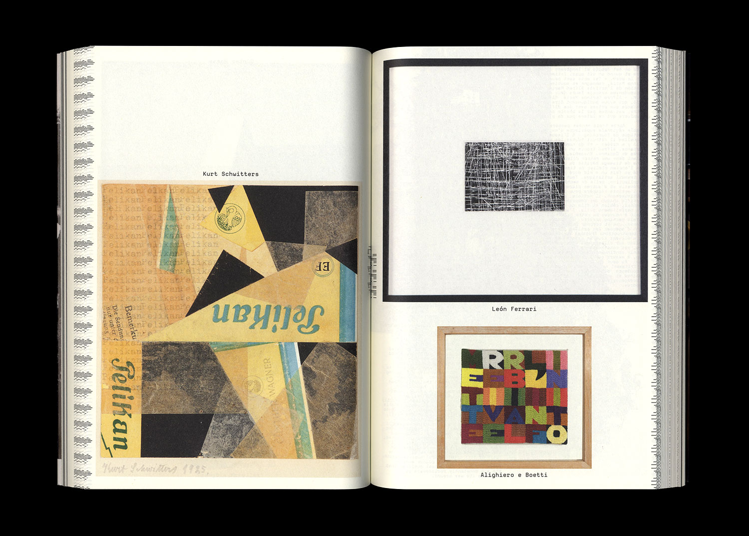
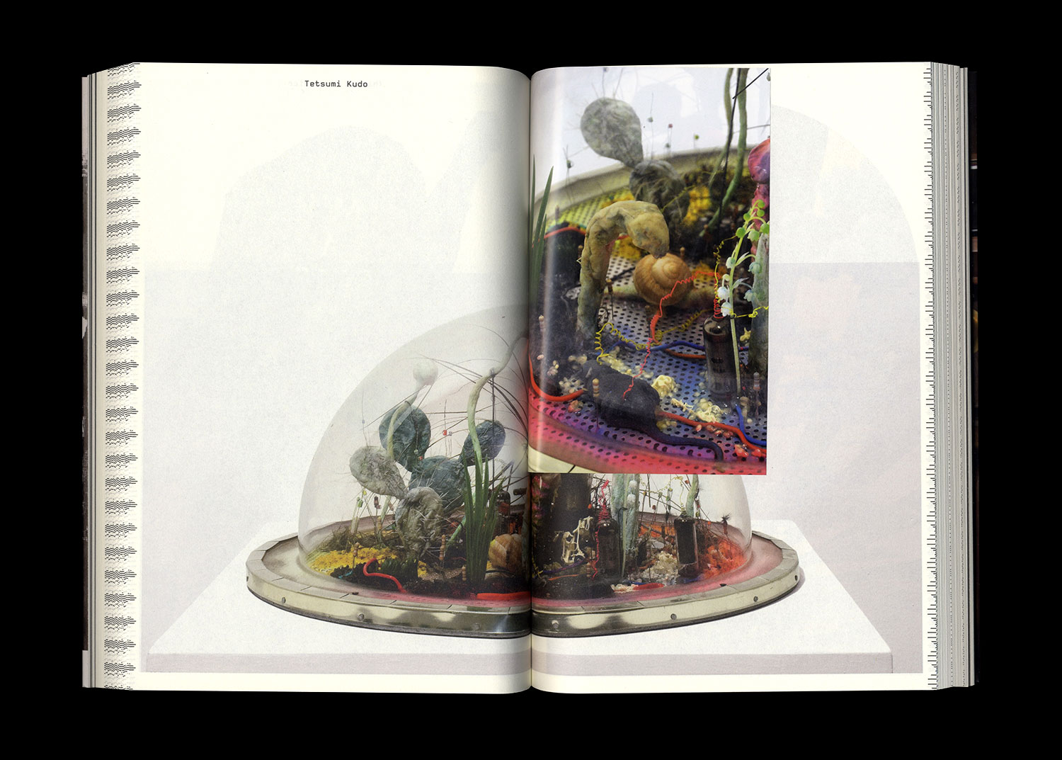
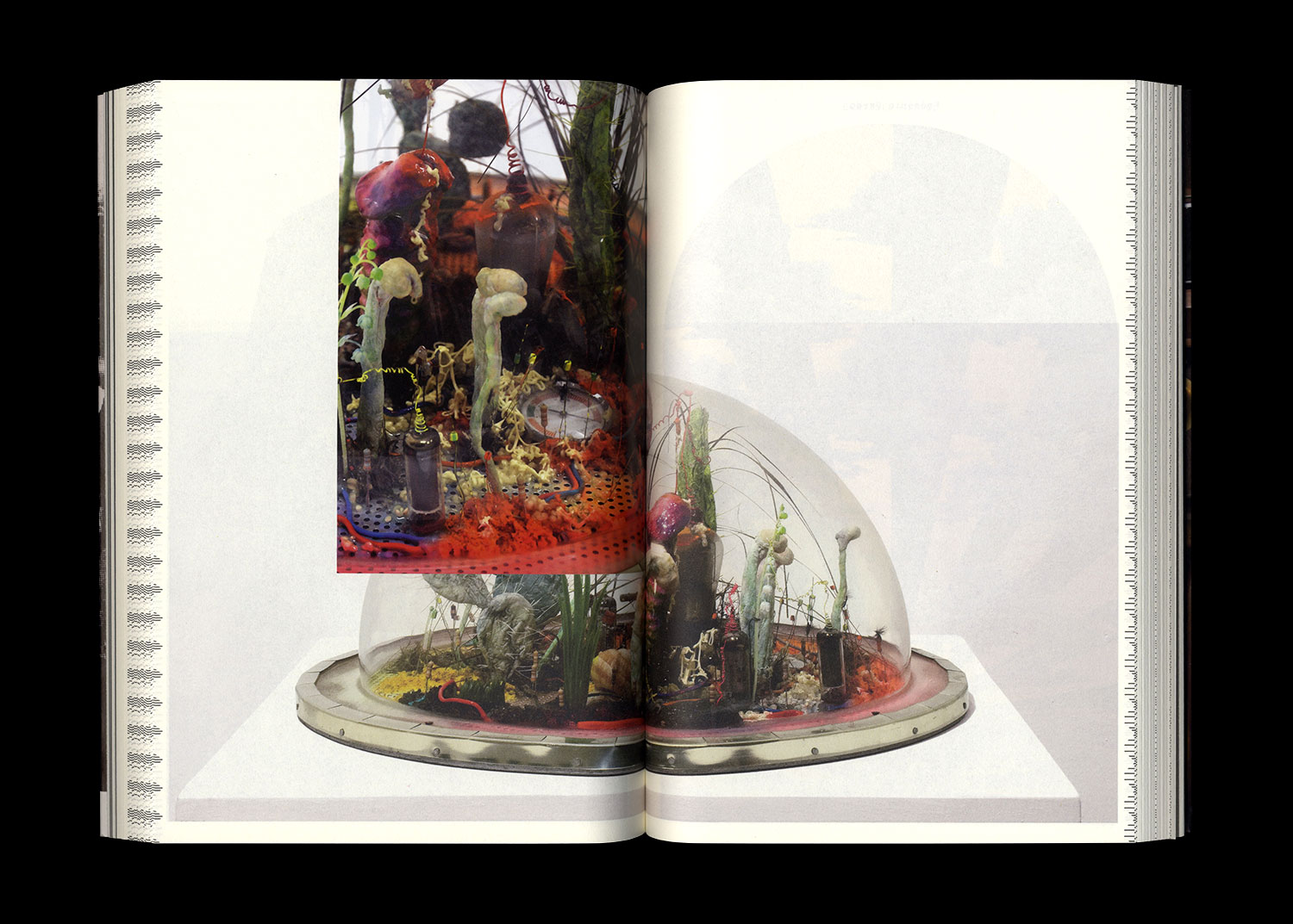
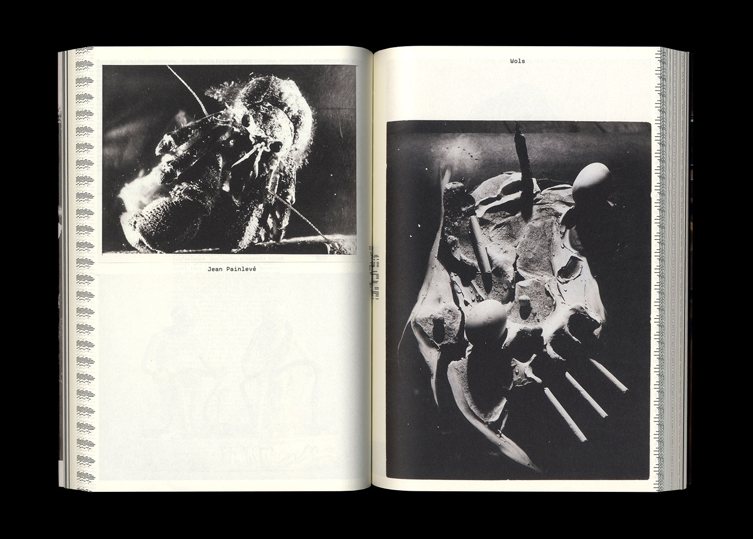
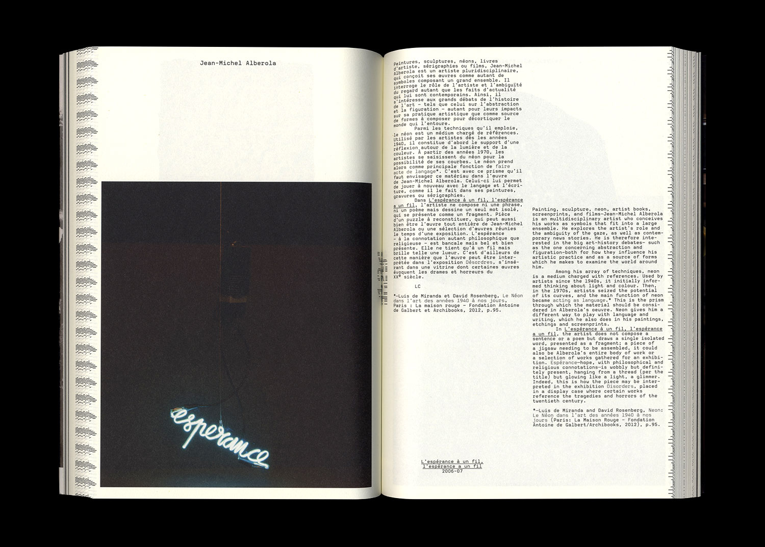
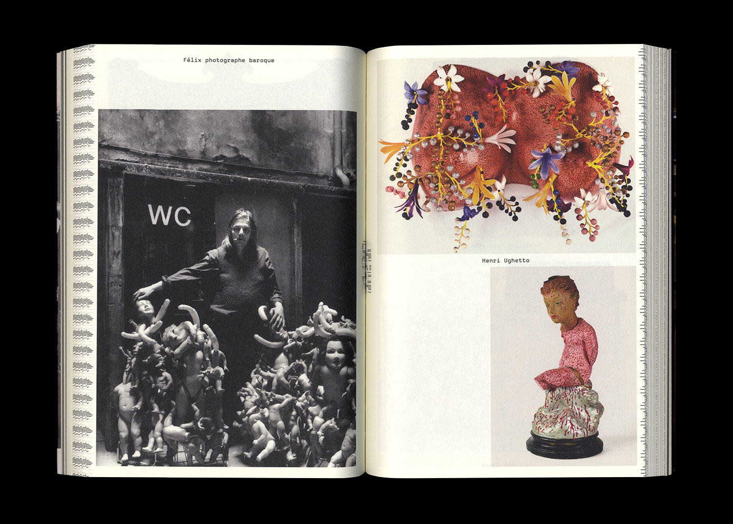
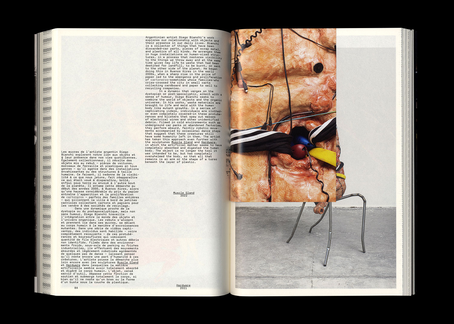
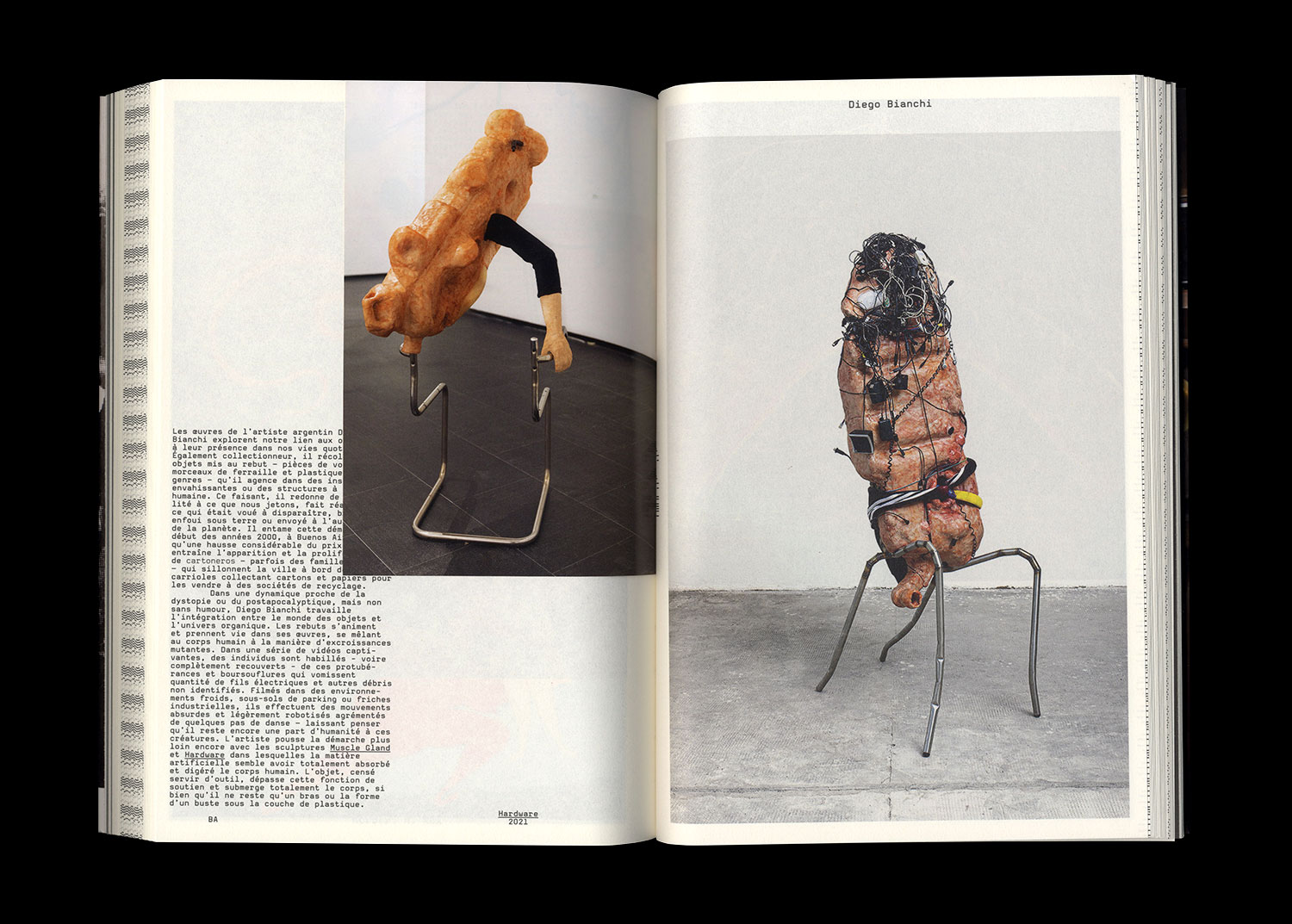
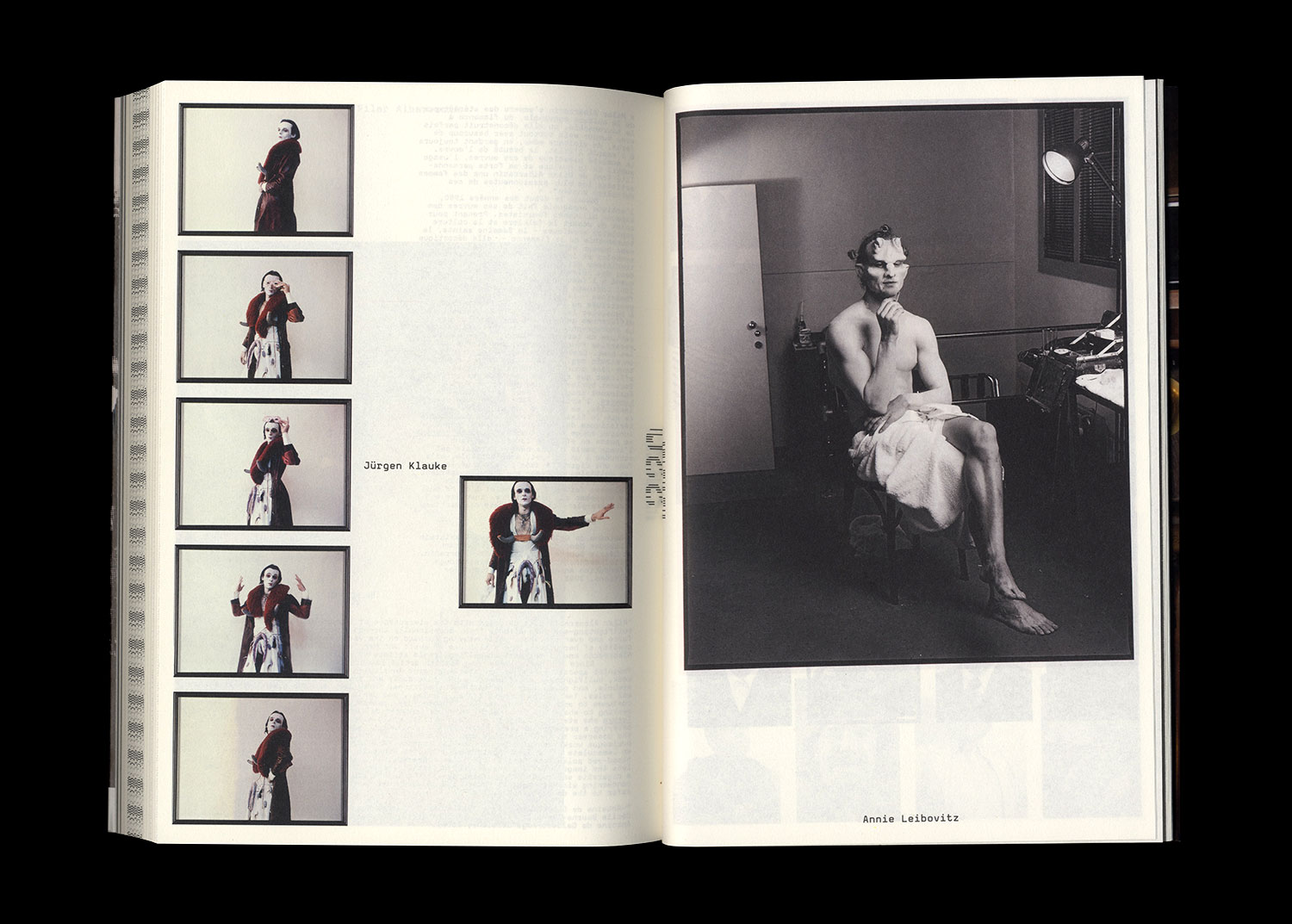
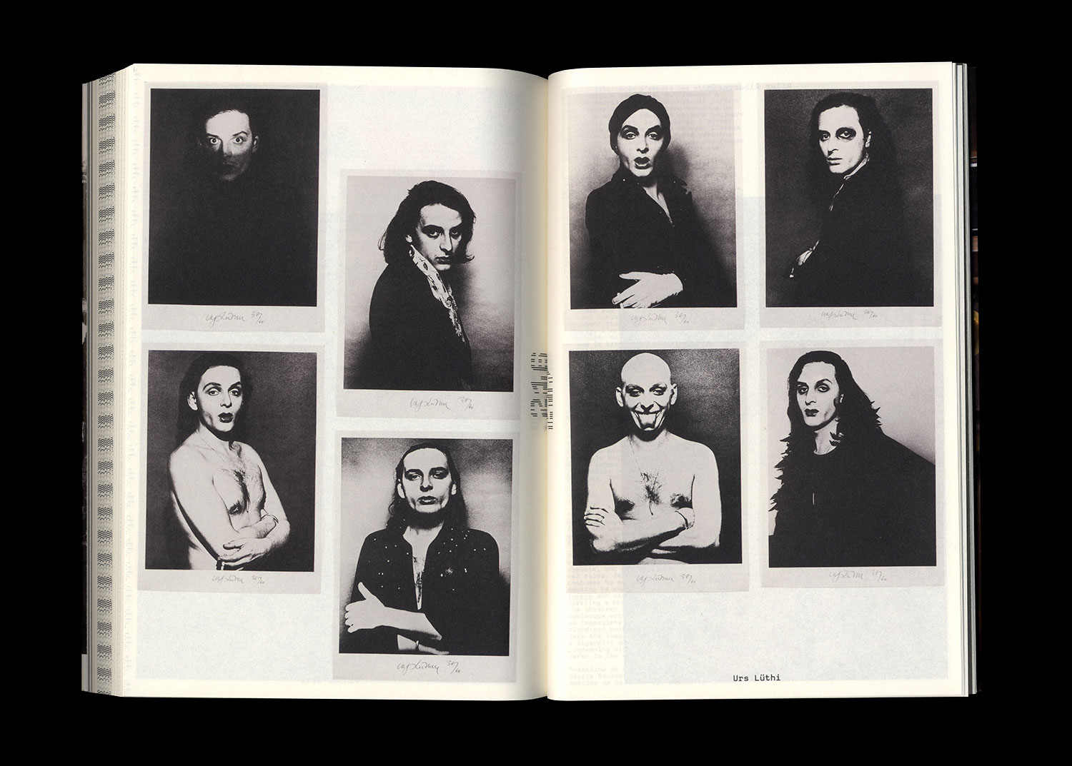
Works by A.C.M., Jane Alexander, Sara Bichão, Miriam Cahn, Roman Cieslewicz, Marcel Dzama, John Isaacs, Richard Jackson, Mari Katayama, Annie Leibovitz, Christian Lhopital, Boris Mikhailov, Kent Monkman, Zanele Muholi, Stéphane Pancréac’h, Raphaëlle Ricol, Mika Rottenberg, Thomas Schütte, Sylvie Selig, Agathe Snow, Stéphane Thidet, Alexander Tsikarishvili, Erwin Wurm, Jérôme Zonder…